THEY'D BUILT UP THEIR REPUTATION, WE HELPED THEM TURN IT INTO A RECOGNISED BRAND.
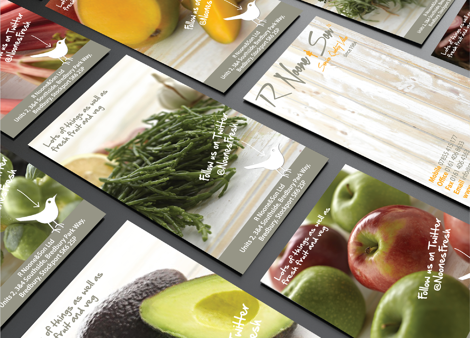
R Noone & Son (or “Noones” as they are affectionately known) had grown through hard work and word of mouth. But the competition had started to creep in on their patch and with no visible brand identity, apart from a logo on a letterhead, it was time for Noones to stake their claim.
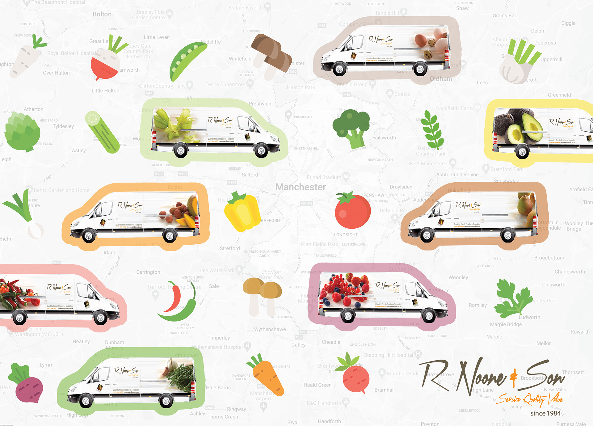
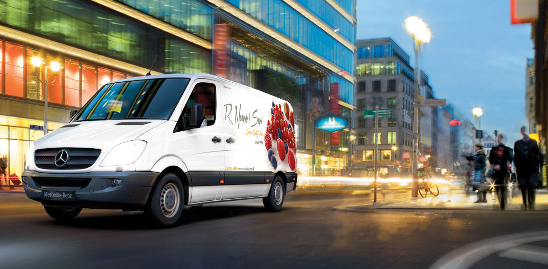
Maintaining their family-friendly and personably approach was important to the owners, as was showcasing their exceptional customer service and handpicked produce. With a fleet of white vans parked up at their depot, vehicle livery was the fastest and easiest way to mobilise the new brand. Today, Noones are one of the most recognised distributors of quality fresh fruit, vegetables and dry store goods to the catering industry across the North West of England.
: Brand Workshop : Market Research : Brand Identity : Logo Design : Photography : Vehicle Livery : Website Design : Art Direction : Design : Copywriting